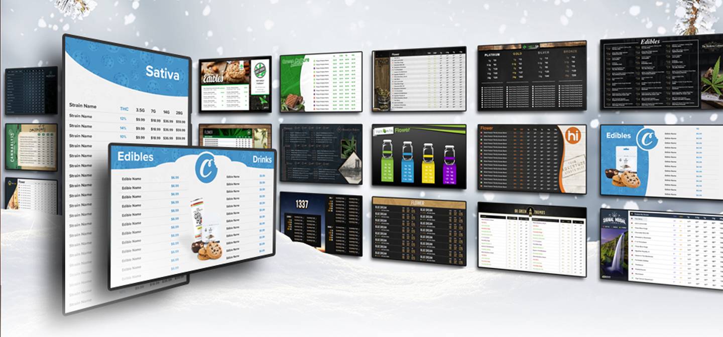
Over the past 12 years, we at Divvy Digital have seen hundreds of ways to use digital menu boards. Some of them good, but most of them terrible. It’s easy to take a tv and throw some words on it. Building a p.o.s. integrated menu that perfectly fits your stores aesthetic is a whole other animal. There are a few do’s and don’ts when it comes to cannabis tv menus that’ll you want to make sure to keep in mind when upgrading your dispensary’s inventory display to a digital menu board system.
The Do's and Don'ts to Cannabis TV Menus
DO – Consider Your Brand’s Design and Aesthetic.
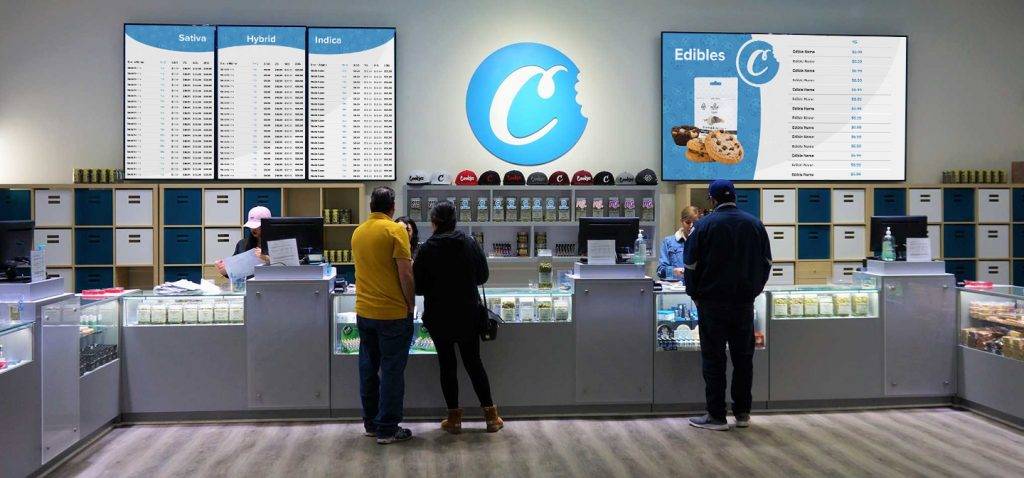
I can’t tell you the amount of times I’ve walked into a dispensary and was immediately distracted by the color choices and layout used on a cannabis tv menu… and not in a good way. Someone once told me that cologne should be discovered, not announced. I think the same sentiment should be used while designing your digital menu system. Obviously you don’t want your customers to have trouble finding the menus, however there is no need to shove the screens in their face. A menu should fit the stores aesthetic, falling into the background when it’s unneeded, but there for support when you need it. A good cannabis tv menu can be your customer’s best friend.
DON’T – Force Your Full Inventory On One Screen.
The obvious thing to do when you first get tv menus is to put every last inventory item on the screen. This might be the exact worst thing you can do. Unless you have a 150″ 4k laser projector, you’re menu is going to look like an absolute mess. Nobody want’s to weed through a spreadsheet at a dispensary.
DO – Focus On Specific Products
The best cannabis tv menus limit their inventory listings to about 10 to 15 products per screen. This amount allows for the best data to display while keeping in mind proper white-space for readability and limited eye-strain. Your tv screen is the best place to inform your customers on the details of the products they want. Consider you screen an extra budtender when the store gets busy.

DON’T – Scroll Your Menu Items
This one is bundled with the last couple notes. One thing we see often is menu’s that endlessly scroll to showcase every last menu item. The only thing worse than displaying every item on the screen is displaying every item on the screen while having them constantly move. Look at it this way. Have you ever sat at the end of a movie, watching the credits, and thought… this is really easy to read. Of course not!
Sign Up For A FREE Cannabis TV Menu Design Consultation
[fc id=’2′][/fc]


